
Small Apartment Zoning & Layout Ideas That Actually Work in Real Homes
Living in a small apartment means accepting a certain daily negotiation with space. Your living room is also your office. Your dining area is also where you do your taxes. Your bedroom, if you have one, becomes the only truly private room you own and often doubles as a reading nook, a dressing room and a place to fold laundry. If you are in a studio, every single function of your life unfolds in one continuous space.
The problem is rarely the size itself. Beautifully liveable apartments under 35 square metres exist; what usually fails is the planning. Most people move furniture based on habit, not logic. The sofa goes against the long wall because that is what sofas do. The desk ends up wherever the cable reaches. The bed faces whichever wall it was against in the last apartment. The result is a space that feels chaotic or cramped even when it is tidy.
Another common mistake is copying layouts from images that were shot in completely different spaces. That airy photograph with the velvet sofa floating in the middle of the room was taken in a specific apartment with specific dimensions and probably a photographer who moved half the furniture out of frame. Your radiator is in an awkward place. Your door opens the wrong way. Your windows sit low on one wall and disappear entirely on another.
This guide is designed to help you think through your actual floor plan, not someone else's. It walks through how to read your space honestly, decide which zones you genuinely need, pick a layout that suits your room's particular shape and use simple, renter-friendly tools to give each zone a clear identity. No products. No shopping lists. Just clear, step-by-step thinking.
Step 1: Understand Your Real Floor Plan Before Moving Furniture
Before a single piece of furniture moves, you need to know exactly what you are working with. This sounds obvious, but it is the step almost everyone skips and it is why so many small apartment layouts end up awkward.
The core issue is that people plan in their heads, not on paper.
They visualise a layout, like how it looks mentally and start pushing furniture around. What they have not accounted for is the door that swings inward and blocks a chunk of wall, the radiator that makes an entire side unusable for seating, the single socket that anchors the TV in the wrong corner or the window that sits so close to the ceiling that a curtain track has nowhere to go.
Every small apartment has fixed constraints: elements you cannot move, cannot paint over and must plan around. These are not problems; they are simply the parameters of the puzzle. The sooner you map them, the faster everything else becomes clear.
How to map your space
Start with grid paper or a simple digital floor-plan tool. Measure your room wall by wall and then note the following directly on your sketch:
- Windows: their positions, widths, and heights from the floor, plus which direction they face.
- Doors: where they sit and which way they swing, so you know the dead zones they create.
- Radiators or heating elements: including a 20–30cm clearance zone in front of them.
- Electrical sockets and data points: where TVs, desks and lamps can realistically live.
- Fixed kitchen or bathroom elements that carve away usable wall space.
- Built-in wardrobes, alcoves, pillars and other architectural quirks.
To make this less abstract, think about three very common realities: the long narrow living room in a 35 square metre apartment, the nearly square studio around 25–30 square metres and the one-bedroom where the bedroom is bright but the living room is dark. Mapping constraints in each of these reveals where your real options live long before any furniture enters the picture.
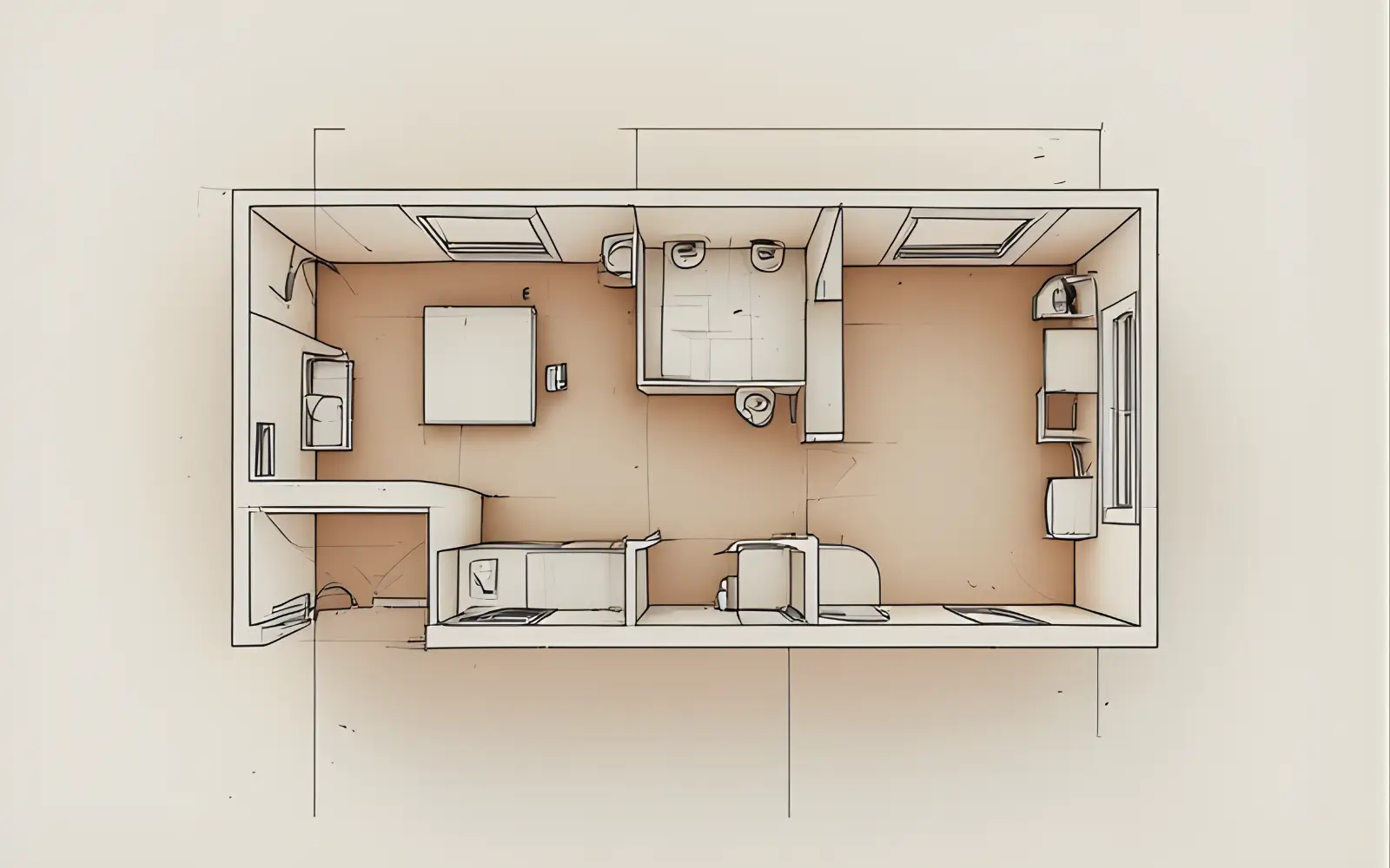
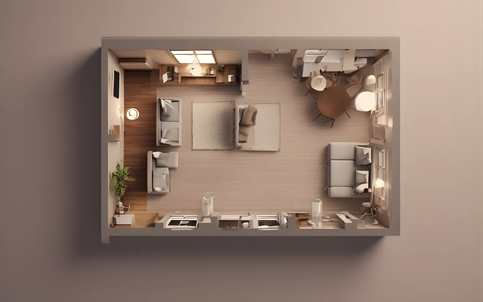
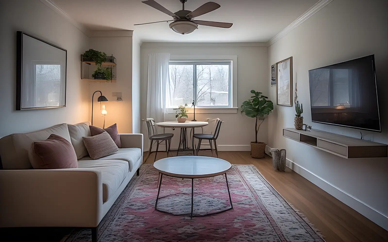
FLOOR PLAN MAP
Mapping the true shape of a small apartment with all fixed constraints noted before any furniture decisions are made.
Step 2: Choose Your Main Zones Instead of Thinking in "Rooms"
Once you know your fixed constraints, the next step is to stop thinking about rooms and start thinking about zones. This is the single most useful mental shift you can make when planning a small apartment.
A zone is a defined area with a specific function.
It does not need walls or a door; it just needs a clear job and some kind of visual boundary that tells both your eye and your brain that this part of the space is for this activity. In a conventional house, rooms do this job automatically. In a small apartment, one open space has to hold multiple functions simultaneously and they can easily bleed into one another.
Zones solve this not by creating physical separation but by creating psychological separation. When the desk is clearly in its own corner with its own light and a rug that defines the area, you leave it at the end of the day. When the sleeping area of a studio has its own bedhead zone and feels visually distinct from the living area, you sleep better in it.
The main zones in a small apartment
Most small homes need some combination of the following:
- Lounge zone: sofa-centred, oriented toward a focal point; where you decompress.
- Work zone: a desk with good task lighting, ideally not in the lounge's direct sightline.
- Dining zone: a surface for eating at, even if it is a narrow bar or fold-down table.
- Sleep zone: especially in a studio, this needs to feel visually distinct from the lounge.
- Entry zone: a small but intentional area near the front door for coats, bags and keys.
- Storage zone: not a dumping ground, but a planned area for items not in daily use.
Zones will overlap, and that is fine. A lounge zone and dining zone can share one open space. A sleep zone and work zone can coexist if they face different directions. The key is that each zone has a clear boundary, even if that boundary is nothing more than a rug or a change in lighting.
ZONES WITHOUT WALLS
Lounge and dining zones sharing one room but reading as distinct areas through rugs and lighting instead of partitions.
Common zoning mistakes and what to do instead
- Trying to fit a full six-seat dining table into a 25 square metre studio. Instead, use a compact round or fold-down table sized for two to four people.
- Placing the work zone inside the lounge zone facing the sofa. Position the desk perpendicular to or behind the sofa, or in a separate corner.
- Having no entry zone at all, so bags and shoes immediately spill into the living area. Carve out even a 60–80cm-wide entry strip.
- Ignoring the sleep zone in a studio and letting the entire space feel like a bedroom. Give the bed a deliberate position and visual boundary.
Step 3: Proven Layouts for the Most Common Small Apartment Shapes
Most small apartments fall into a handful of basic shapes. Working with the shape you actually have is far more effective than fighting it. The following layout recipes focus on what tends to work in real rooms, with honest notes on compromises.
Long, narrow living room layout
A typical long narrow living room in a small apartment might measure around 2.8 by 5 metres. It is one of the most challenging shapes because every instinct works against you. The room feels like a corridor and most furniture arrangements only emphasise that.
Layout option A: the across-the-width sofa placement.
Instead of placing the sofa along the long wall, place it across the width of the room, perpendicular to the long axis. This immediately divides the room into two functional halves: a clear lounge zone in one half and usable space in the other half for a small dining table, desk or entry area.
Position a compact two- or three-seater sofa across the width at roughly the midpoint. Orient it toward the short wall where your TV or focal point sits. Leave at least 90 centimetres of circulation space between the back of the sofa and any furniture behind it, then use the remaining half of the room for dining or work.
Layout option B: furniture along one long wall, desk in the corridor zone.
If the room is genuinely under 2.6 metres wide, you may not have enough width to place a sofa across it comfortably. In that case, place the sofa along the longer wall but float it 30–40 centimetres away from the wall instead of pushing it flat against it. A slim console table behind the sofa creates depth and a visual back wall to the lounge zone.
In both options the goal is the same: break the corridor effect by creating cross-room moments. Your eye should be drawn across the width of the room, not only along its length. Rugs are essential here; a rug that runs across the room, rather than along it, reinforces this effect.
- Avoid placing furniture along both long walls facing each other; it creates a waiting room effect.
- Be wary of deep corner sofas that eat all the width and block the traffic lane.
- Keep coffee tables modest in length so they do not extend the corridor feeling.
NARROW ROOM OVERHEAD
Long narrow living room planned to avoid the corridor effect by placing the sofa across the width and splitting the space into two clear zones.
Square small living room or studio layout
Nearly square rooms, such as a 4 by 4.5 metre studio or a 3.5 by 3.8 metre living room, are forgiving in one way because no single wall dominates. The risk is that furniture ends up either scattered in the centre or pushed to all four walls with a void in the middle.
Start with the largest piece: usually the bed in a studio.
Place the bed against the wall farthest from the front door, ideally on a solid wall without windows. This gives it a sense of permanence and keeps it visually at the back. If possible, orient the bed so the headboard sits against the wall and the length of the bed runs out into the room instead of facing the door head-on.
From there, place the sofa perpendicular to the bed, ideally with the back of the sofa facing the sleep zone. The sofa back becomes a visual boundary between sleeping and living. The TV or focal wall sits opposite the sofa, and a small round dining table fits into the remaining corner, ideally near the kitchen.
For the work zone, one of the corners near a window becomes a natural desk area. Because it sits slightly apart from both the sofa and bed, it reads as its own zone without needing extra dividers.
In studios under 25 square metres, be realistic about the dining zone. A sofa, a bed and a desk already occupy much of the room. A narrow bar-height ledge along the kitchen counter may be more practical than a full dining table.
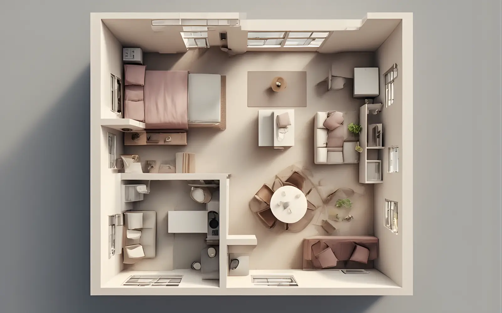
SQUARE STUDIO OVERHEAD
Square studio layout that clearly separates sleep, lounge, dining and work zones without wasting the middle of the room.
L-shaped or awkward open-plan layouts
L-shaped spaces often appear in open-plan one-bedrooms or older flats where two rooms have been combined. They can feel awkward at first, but the two legs of the L are actually a gift: they give you a natural, architectural reason to separate zones.
The longer leg is almost always the better lounge zone because it has more uninterrupted wall space for a sofa and focal wall. The shorter leg, often narrower or partially occupied by the kitchen, becomes the dining zone, work zone or entry zone depending on your life.
Map both legs carefully, including the inner junction. Place the sofa in the longer leg, floated slightly inward and facing the main focal wall. The back of the sofa will naturally face the other leg, creating separation. In the shorter leg, place a dining table or desk so it feels anchored by a window or wall, not adrift in the middle.
- Treat the inner corner of the L as a transition, not a place for big furniture.
- Assign any far outer corners a deliberate function, such as a reading chair or compact desk, so they do not become dumping grounds.
- Avoid large sectionals that straddle the junction; they usually block circulation.
L-SHAPE ZONING
L-shaped open-plan space where each leg holds a different function and the junction is treated as a calm threshold instead of a dumping ground.
Step 4: Zoning Tools That Do Not Involve Building Walls
Once your layout is decided, the next layer of work is making each zone feel visually coherent and distinct. In a small apartment, walls are rarely an option, but several tools are remarkably effective at creating boundaries that are visible, logical and removable.
Rugs
A rug is one of the most powerful zoning tools in a small apartment. It defines the footprint of a zone as clearly as a room divider. In a lounge zone, aim for a rug large enough that at least the front sofa legs sit on it. Tiny rugs that only support a coffee table make the seating group look like it is floating.
In rooms under 3.5 metres wide, a rug of around 160 by 230 centimetres often works well. In a square studio, 200 by 200 or 200 by 240 centimetres can define the lounge zone while leaving sleep and dining zones visually separate. Rugs also improve acoustics and are completely renter-friendly.
RUGS AND LOW SHELVES
A large rug and low bookcase working together to anchor the lounge zone and softly separate it from the rest of a small apartment.
Lighting
Different light sources at different heights and intensities are an underused zoning tool. Overhead lighting treats the entire room as one undifferentiated space. When the lounge has a floor lamp and table lamp, the dining zone a pendant and the desk its own task light, each area becomes visually self-contained.
The rule of thumb is simple: each zone needs its own light source positioned within the zone, not shared between functions. A single ceiling light shared by a sleeping and lounge area guarantees that both will always feel like one room.
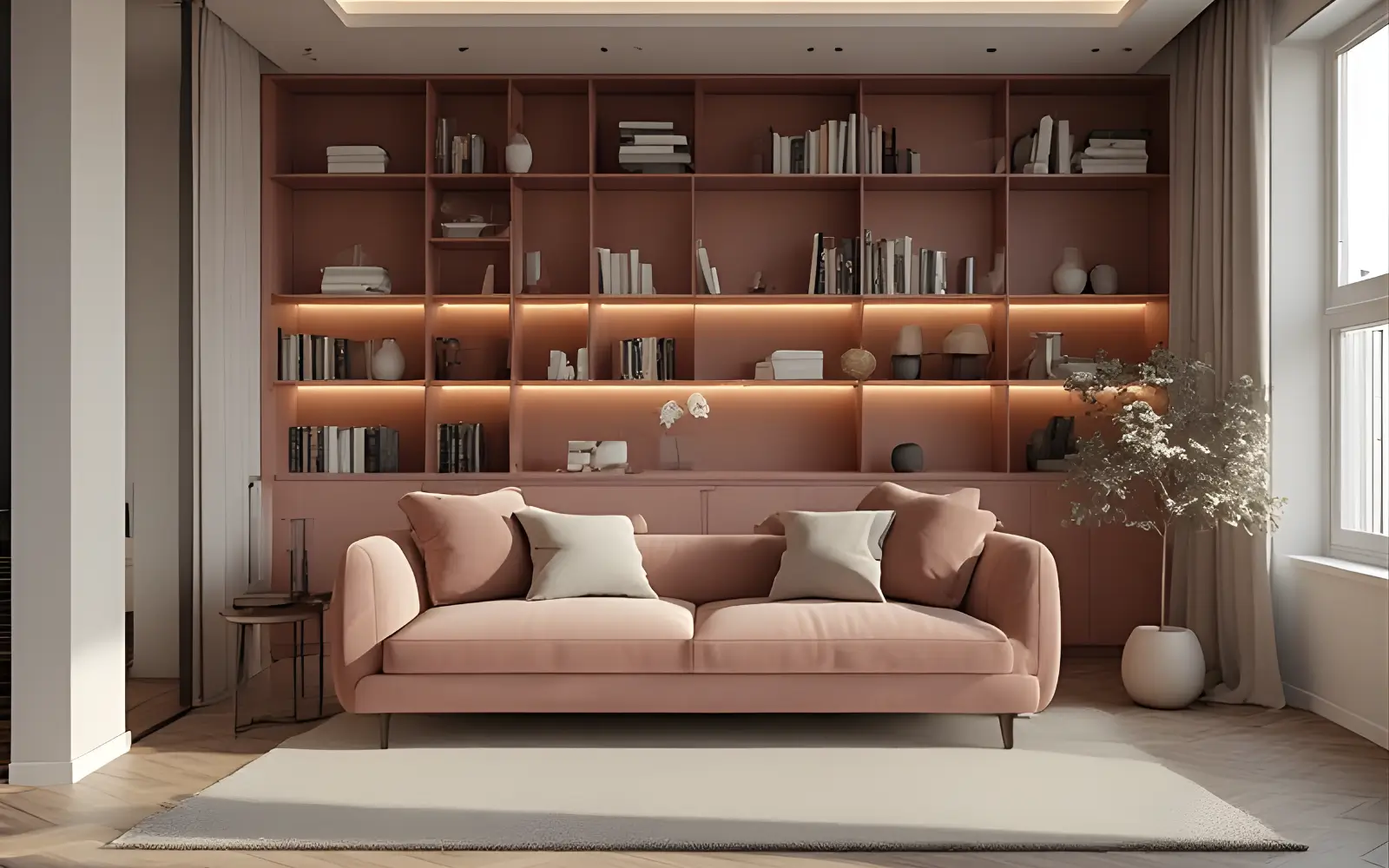
Colour, shelving and soft dividers
A change in wall colour or wallpaper immediately reads as a defined area. In a studio, a painted or wallpapered wall behind the bed creates a headboard zone that gives the sleep area visual weight. Peel-and-stick options now make this achievable for renters.
Low shelving and open bookcases placed between zones allow light to pass while creating a soft boundary and providing storage on both faces. Aim to keep these pieces under about 140–150 centimetres tall so they feel like dividers rather than walls.
Floating the sofa away from the wall and letting its back face the sleeping area can also be enough to separate lounge and sleep zones. Adding a slim console behind the sofa gives you a place for lamps and books and strengthens the separation.
Curtains, panels and flooring changes
Ceiling-mounted curtains or sliding panels can conceal a sleep or work zone without any permanent fixtures. Tension rods and removable track systems are increasingly accessible for renters. When drawn, they allow a studio bed to disappear entirely; when open, the apartment reads as one continuous room.
For owners, a change in flooring material between kitchen and living or between entry and lounge is one of the most architectural ways to define zones without adding walls.
Step 5: Real-Life Layout Recipes for Tiny Apartments
The following scenarios are composites of the kinds of small apartments we work with most often. The names are fictional, but the spatial problems and solutions are very real.
Case study 1: 35m² studio for sleep, living and work
A single rectangular room of roughly 4.8 by 7 metres, with a kitchen along one short wall and a large window on the opposite short wall, must function as bedroom, living room and office. The front door opens mid-way along a long wall, cutting through the centre of the space.
The bed sits against the long wall opposite the front door, head toward the kitchen end with no natural light. A low bookcase at the foot of the bed extends into the room, creating a visual back wall to the sleep zone. The sofa faces this bookcase, back toward the bed, forming a bright lounge zone in the middle of the room near the window.
A small round dining table under the window becomes both dining area and breathing space. A compact desk sits near the kitchen where sockets allow, with a curtain on a tension rod to close it off at the end of the workday. A rug anchors the sofa zone; the dining area stays rug free for contrast.

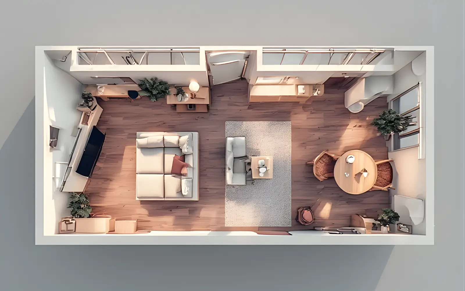
35M² STUDIO BEFORE/AFTER
How a studio transforms when furniture moves away from the walls and each function is given a clear zone on the floor plan.
Case study 2: 45m² one-bedroom, living room and work-from-home
In a 45 square metre one-bedroom flat, the narrow living room must handle work, TV, eating and the occasional guest. There is no dedicated office elsewhere. The solution begins by placing the sofa across the narrower axis, floated off the back wall with a console behind it. The TV mounts on the short wall opposite at eye level.
A desk sits at the far end of the long wall behind and to the side of the sofa, deliberately outside the main sightline when seated. A ceiling track with curtains can slide across to conceal the desk entirely after hours. A fold-down wall table between the entry door and sofa becomes a dining surface only when needed.
Case study 3: 30m² square studio with generous light
A roughly 5.5 by 5.5 metre studio with windows on two adjacent walls has beautiful light but no obvious anchor wall. The tenant's first instinct was to push all furniture to the walls, leaving an empty centre that felt unfinished.
The bed moves into the darkest corner with a fabric headboard panel and a pendant above it. The sofa floats in the middle of the room, angled slightly toward the corner window, breaking the all-against-the-walls effect. A small round dining table sits between sofa and kitchen counter and a generously sized rug under the sofa anchors the floating arrangement.
Common Mistakes to Avoid in Small Apartment Layouts
Even with the best intentions, certain habits consistently undermine small apartment layouts. These are the mistakes worth catching early.
- Pushing all furniture to the walls, which creates a waiting-room feeling instead of depth and intention.
- Blocking natural light with tall pieces near windows. In a small space, daylight is your most valuable asset.
- Relying on multiple small chairs instead of one good compact sofa, which fragments seating without adding comfort.
- Placing the TV where it fights the main window and forces you to keep blinds closed.
- Choosing a coffee table that is too large for the sofa and traffic lanes.
- Ignoring the entry zone and letting bags and shoes spill into the living area.
- Treating storage as an afterthought so it accumulates as visual clutter instead of being given a clear home.
NARROW ENTRY ZONE
Even a tiny strip of wall beside the front door can become a calm, functional entry zone when it is treated as its own micro area.
Bringing Your Small Apartment Layout Together
The process here follows a simple but powerful sequence: map the room, identify fixed constraints, define the zones you actually need, choose a layout that matches your room's shape and then layer in zoning tools to make each zone legible.
None of this requires renovation or a large budget. It requires time, a measuring tape, some grid paper and a willingness to question habits, especially the habit of copying layouts from spaces that look nothing like yours.
One thoughtful, deliberate layout is worth more than ten rounds of rearranging. When you have mapped your constraints, assigned your zones and placed each piece of furniture with a reason, the room settles. It stops feeling like a problem and starts feeling like a home.
A small apartment, planned well, is not a compromise. It is a different kind of home that rewards clarity, intention and restraint, and those are exactly the qualities that make a space feel genuinely beautiful.
Related room guide
If you are planning a small bedroom inside your apartment, start with the main hub article:
Aesthetic Room & Bedroom Ideas for Small Apartments – layouts, lighting, colour and storage recipes for cozy, feminine bedrooms.
Small Living Room Ideas That Make a Tiny Lounge Feel Larger
There is a particular kind of frustration that comes with a small living room. The sofa seems too big the moment it is in, the coffee table is always in the way, the TV never feels quite in the right place and the room rarely settles into feeling like a proper lounge. It can feel more like a collection of furniture waiting to be rearranged than a room with a clear purpose.
In many small apartments and studios, the living room is also where you work, where you eat dinner when the kitchen is too small, where guests sleep and where you decompress at the end of a long day. That is a remarkable amount of pressure for a room that might be 14 or 16 square metres.
The good news is that the problem is almost never the size. Some of the calmest, most liveable living rooms we work with are under 12 square metres. The difference between a cramped room and a generous one is almost always decision-making: what the room is actually for, where each piece of furniture sits and how the visual weight of each element is managed. Size is a constraint, not a sentence.
In this guide, this small living room becomes a jewel box. The goal is to refine the layout, seating, storage and styling until the room feels bigger, calmer and more intentional. If you have not yet mapped your overall floor plan or thought through how your zones relate to each other across the apartment, there is a dedicated zoning and layout guide earlier in this hub. Here, we are working specifically inside the living room zone layer by layer.
Step 1: Decide What Your Living Room Is Really For
Before moving a single piece of furniture or choosing a paint colour, the most useful thing you can do is decide, honestly, what this room needs to do for you. In a 25 to 40 square metre flat, the living room is often asked to be everything at once: lounge, home office, dining area, guest bedroom, reading room and creative space. When a room is planned around all of those functions equally, it ends up doing none of them particularly well.
There is always a desk in the corner covered in work things that you cannot fully relax around, a dining table that takes up floor space six days a week for one dinner and a pull-out sofa that makes the room feel like a hotel lobby even when it is folded away. Clarifying priorities prevents this.
A quick diagnostic exercise
Before planning anything, spend a few minutes answering two questions honestly. First, in a normal week, how do you actually use this room? Not how you imagine using it, but what really happens. Do you work here every day? Do you eat here or mostly in the kitchen? Do guests sleep here more than a couple of times a year?
Second, what do you wish you could do here that you currently cannot? Maybe it is sitting comfortably and reading without a desk in your peripheral vision. Maybe it is having two friends over for dinner without it feeling cramped. Maybe it is simply coming home and immediately feeling calm.
The answers will reveal your top two or three functions, and those are the only functions this room needs to be planned around. Trying to design for six different functions in a tiny space is what makes it feel like a compromise instead of a home.
Three common small living room profiles
One profile is the work from home room. You are in this room for most of the day at a desk, and the lounge is secondary, something you switch into at six o'clock. For this profile, desk placement and its visual separation from the sofa are the priority. Everything else serves those two zones.
Another is the social room. You do not work here much, but you regularly host friends for dinner or evening drinks. Flexible seating and a proper surface for eating and drinking matter more than a permanent desk. The sofa arrangement needs to work for conversation, not only for watching TV.
The third is the calm retreat. You live alone or as a couple, you work elsewhere and what you want most is to come home to somewhere that feels genuinely restful. Storage needs to be thorough because visual clutter undermines calm, the sofa needs to be deeply comfortable and lighting matters more here than in almost any other profile.
Worth prioritising in a tiny living room:
- One very comfortable, correctly sized sofa.
- A defined focal point such as a TV wall, fireplace or large window.
- Layered lighting rather than a single overhead source.
- Enough storage to keep most everyday surfaces clear.
- A rug that anchors the seating group.
Nice to have, but genuinely optional if space is tight:
- A full separate dining table.
- More than one additional armchair.
- A large, built-in media wall system.
- A permanent guest sleeping surface if visitors are rare.
- Decorative objects beyond a couple of pieces you genuinely love.
Step 2: Choose the Right Sofa for a Small Living Room
The sofa is the most consequential furniture decision in a small living room. It occupies more floor space than any other single piece, it defines the character of the room and it is the piece most often chosen for the wrong reasons, usually because it looks beautiful in a showroom rather than because it fits the room it is going to live in.
How big should a sofa be?
The single most important measurement on a sofa is not its length, it is its depth. A deep, plush sofa that is 100 centimetres from front to back will consume the floor plan of a small room far more aggressively than a longer sofa at around 82 to 90 centimetres deep. In a living room under three and a half metres wide, aim for a maximum sofa depth of around 85 to 90 centimetres.
For length, a two seater between roughly 160 and 180 centimetres is often the right choice for rooms under 14 square metres. A three seater between about 185 and 210 centimetres works well in rooms between 14 and 20 square metres, provided the depth stays within that 85 to 90 centimetre range. These dimensions leave enough floor space for breathing room around the sofa, at least 40 to 50 centimetres of clearance between the sofa front and the coffee table and a clear walkway of 80 to 90 centimetres on any side that forms part of a traffic route.
Scale is not just practical, it is visual. A sofa correctly scaled for the room will make the room look bigger, even if it is physically small. A sofa that is slightly too large will make even a generous room feel tight. When in doubt, err smaller on the sofa and invest in the quality of its construction, fabric and cushion filling instead.
One well chosen, comfortable sofa almost always outperforms two or three smaller chairs in a small living room. Multiple small chairs fragment the room visually, create awkward circulation paths and often offer less actual comfort. For flexibility, a single footstool or a pair of low stools that tuck under the coffee table will give you extra seating without permanently occupying the floor plan.
Corner sofa vs straight sofa vs loveseat
A small corner sofa can work beautifully, but only in the right room. It requires a genuinely square room where both legs of the corner can sit against walls without blocking doors or windows, and the total footprint has to be measured carefully. In an L shaped room where the shorter leg creates a natural alcove, a compact corner sofa can fill that space efficiently and make the room feel intentionally planned.
A straight sofa with a separate footstool is the most flexible option for the majority of small living rooms. The footstool can move out of the way, be used as a low seat for guests, double as a coffee table with a tray or shift position depending on the day. It gives you the lounging comfort of a corner sofa without the permanent footprint.
A loveseat, typically around 130 to 150 centimetres long, is worth considering if you live alone in a very narrow room or if the room genuinely cannot accommodate anything larger. For anyone who regularly has a second person in the room, a loveseat often proves frustratingly small after the first few weeks.
On back height and leg style, a sofa with a low or medium back will feel less visually dominant in a small room than a tall, high back model. Slim, raised legs that leave even a small gap between the base and the floor allow light to travel underneath and make the whole room feel lighter. Sofas that sit directly on the floor tend to visually block the room in a way that is disproportionate to their actual size.
CORRECTLY SCALED SOFA
Compact sofa, large rug and low media unit working together to keep a tiny living room feeling generous instead of cramped.
Step 3: TV, Media Wall and Focal Point
Almost every small living room has a television and most guides to making a small lounge beautiful treat the TV as something to be hidden. A better approach is to design around it honestly. A television is part of daily life for most people, and planning for it directly produces better results than pretending it is not there.
Where to put the TV
The most important rule about TV placement is simple and often ignored. Avoid placing the TV directly opposite the main window. A window behind the sofa throws light straight onto the screen, making it hard to watch during the day and creating distracting glare in the evening. The TV should sit on a wall perpendicular to the main window or on a wall where daylight falls at an angle rather than directly.
The second consideration is viewing distance. As a broad guide, the distance between the TV and your eyes should be roughly one and a half to two and a half times the diagonal size of the screen. In a living room where the sofa sits only a couple of metres from the TV wall, a slightly smaller screen often gives a more comfortable and proportionate experience than the largest model that fits on paper.
Getting the viewing distance right is not just about eye comfort. If the TV forces the sofa to sit closer to the wall than feels natural, the whole room will feel cramped. Choosing a screen size that fits the actual distance available is one of the most underrated small living room decisions.

LIGHTWEIGHT TV WALL
Wall-mounted TV and low media unit that keep the focal wall calm and proportionate in a small living room.
Media units that do not overwhelm a tiny room
The traditional media wall, a floor to ceiling unit spanning the full width of the TV wall, is almost always too much for a small room. It fills the most important wall with visual weight and creates a dark, heavy mass that dominates the space.
A far better approach is a wall mounted TV paired with a low, slim media unit, no more than around 45 to 50 centimetres deep and 45 to 55 centimetres high. This keeps the TV at a comfortable eye height when seated and leaves the wall above clear, so the unit reads as a contained, tidy zone for remotes, consoles and cables.
Matching the media unit closely to the wall colour, rather than choosing a high contrast piece, reduces its visual weight dramatically. A unit in a warm off white or similar tone almost disappears; it functions without shouting for attention.
When the focal point is not the TV
In some small living rooms the television competes with another focal point, such as a fireplace, a large window or a statement wall. The rule is to choose one focal point to lead and deliberately subordinate the other. Trying to give equal weight to both splits the room's attention and makes everything feel slightly uncertain.
If the room has a beautiful fireplace, consider placing the TV to the side on an adjacent wall or on a low unit beside it rather than above. If the main window is the strongest architectural element, a gallery wall or large artwork on a perpendicular wall can serve as the seating focal point, with the TV placed more discreetly.
Step 4: Coffee Tables, Side Tables and Flexible Surfaces
The coffee table is one of the most useful pieces in a living room and one of the most common culprits in making a small room feel cluttered. Getting this decision right has a surprisingly large impact on how the room feels day to day.
Coffee table size and clearance
As a baseline, aim for a coffee table no longer than about 60 percent of the sofa length. In front of a 185 centimetre sofa, that means a table of roughly 110 centimetres or less. Anything longer begins to visually compete with the sofa and can feel like a barrier.
The height should be around level with, or slightly below, the sofa seat height so that it is genuinely easy to reach from a seated position. Equally important is the clearance around it. Leave at least 40 centimetres between the sofa front and the table and around 45 to 50 centimetres between the table and any other furniture edge.
Alternatives to a conventional coffee table
In a living room under roughly 14 square metres, a conventional rectangular coffee table often takes up more floor area than it earns. A pair of nested tables provides the same surface area but can separate when needed and stack when not in use, which is useful in a multi use room.
An ottoman with a tray offers a surface, a footrest and sometimes hidden storage for blankets or magazines. Two small side tables on castors can replace a central table entirely in a very narrow room. They do not occupy the middle of the floor, they move easily and they provide exactly the surfaces you actually use.
In a living room under roughly 11 or 12 square metres where the sofa is already working hard, no coffee table at all can be the right answer. One small side table and an ottoman for a footrest may be enough and the saved floor space makes a genuine difference.
Smart surface ideas for tiny living rooms:
- Ottoman with tray and internal storage.
- Nested tables that stack together and separate on demand.
- Side tables on castors that move freely.
- A slim console table behind the sofa as a landing spot for lamps and books.
- A small fold down wall bracket used for ad hoc dining.
Surfaces that usually make small rooms feel crowded:
- A coffee table longer than about 60 percent of the sofa.
- A glass topped table paired with a very busy, high contrast rug.
- Several separate tables squeezed into the same 10 square metre seating zone.
- An oversized coffee table positioned so that clearance drops below roughly 35 centimetres.
Step 5: Storage That Does Not Eat the Room
Storage in a small living room has two competing demands. There has to be enough of it to keep surfaces clear and the room visually calm, and it must not take up so much space or visual weight that it makes the room feel smaller. The resolution is in the detail: the height, depth and finish of what you choose and how open versus closed storage is balanced.
Low storage for calmness
One of the most successful storage strategies in a small living room is a run of low, closed units along one wall, typically the TV wall or a wall adjacent to it. Keeping storage below around 55 to 60 centimetres in height preserves the wall area above for art, a mirror or simply empty space, which acts as visual breathing room.
Low closed units in the same finish as the wall, or a tone very close to it, are especially effective. When the unit blends into the wall, the eye reads the wall as continuous rather than interrupted. The unit's function becomes almost invisible, while the top surface can hold one or two objects and a lamp.
These low units can also serve double duty. A run of storage under a window becomes a window bench when the top is padded or topped with cushions. In a room where seating options are limited, that dual function is genuinely valuable.
Vertical storage that still feels light
Vertical storage is sometimes necessary, particularly for books, records or larger objects. Here, the principle is to keep it slim and specific. A bookcase roughly 25 to 30 centimetres deep is enough for most paperbacks and takes significantly less floor area than a standard 35 to 40 centimetre unit.
Stopping the bookcase 20 or 30 centimetres short of the ceiling rather than running it all the way up makes it feel more like a piece of furniture and less like a wall. Asymmetrical arrangements, such as one tall unit with a shorter run beside it, usually feel lighter than rigid grids. Keeping tall storage away from windows prevents it from blocking peripheral light.
Hide the ugly things
Every living room has objects that are necessary and not especially beautiful, from routers and cable tangles to board games and spare blankets. These are not a personal failure; they are simply the reality of daily life. The goal is to give each of them a specific, closed home so that the visible room remains calm.
A closed drawer or cupboard in the media unit is the correct home for the router. Cables can be routed through a channel fixed to the wall or bundled behind the unit with cable clips. Spare blankets belong in the ottoman's internal storage or in a flat basket on a low shelf, not draped permanently over the sofa arm. Board games and rarely used items are best kept behind a door.
One principle that consistently works is to designate a single shelf or basket as the working mess zone, the place where current projects and in progress items can live temporarily without spreading across surfaces. When everything untidy has a defined container, the rest of the room stays clear without constant effort.
Step 6: Make a Small Living Room Feel Bigger
The aim here is not decorating tricks for their own sake. Each decision addresses how the eye reads space and how the brain interprets proportion, depth and light. Done together, they make a small living room feel significantly larger.
Colour and contrast
The relationship between wall colour and perceived room size is more subtle than the generic advice implies. Painting everything bright white can make a small room feel stark or cold. Warm, medium light tones such as soft off whites, warm stone or pale warm grey tend to work better. They make walls recede gently and feel calm rather than clinical.
The principle for small rooms is to keep contrast low on large surfaces like walls, floors and big pieces of furniture and reserve stronger contrast for smaller, considered moments. When large surfaces are close in tone, the eye moves smoothly through the room and the space feels quieter.
For the ceiling, keeping it lighter than the walls prevents a compression effect. A ceiling that is the same tone or darker makes the room feel lower. A ceiling one or two tones lighter gives the eye somewhere to rise to and the room feels taller.
Curtains, rugs and textiles
Curtains are one of the highest impact styling decisions in a small living room and they are almost universally done wrong. Hanging curtains at window height and using tracks the exact width of the frame makes both the window and the room feel smaller.
Instead, hang curtain tracks as close to the ceiling as possible and extend them beyond the window frame so that when the curtains are open, the glass is fully uncovered and the fabric stacks against the wall. The window appears wider, the room appears lighter and the ceiling feels higher.
For rugs, the most important principle is scale. In a small living room, the rug should be large enough for at least the front sofa legs to sit on it and ideally all four legs of the seating group. A rug that only covers the area under the coffee table makes the room feel more fragmented. In many small rooms, a 160 by 230 centimetre rug is a good starting point.
Texture matters more than pattern. A rug in a flat, low pile in a warm neutral will feel luxurious without competing visually. Heavy, high contrast patterns add visual noise that quickly becomes tiring in a compact room. Bouclé, loose linen weaves and low pile wool blends on sofas, cushions and throws add tactile richness without clutter.
Lighting layers for a calm evening mood
A single overhead light is one of the fastest ways to make a small living room feel institutional. It throws even illumination across the whole room with no shadows, no warmth gradient and no sense of different zones.
Layering solves this. A floor lamp positioned at one end of the sofa or just behind it creates a warm pool of light that makes the seating group feel like a sanctuary. A table lamp on a side table or on a console behind the sofa adds another layer closer to eye level. A small ambient lamp near the media wall balances the brightness of the TV in the evening and reduces eye strain.
If you must keep an overhead light, replacing a bare fitting with something dimmable and keeping it low in the evenings helps. The goal is that by night, the room is lit mostly by floor and table lamps, with overhead lighting turned off or down to its lowest setting. That shift alone makes the room feel warmer, calmer and noticeably larger.
Step 7: Multi Use Living Room Layouts
For many women living in small apartments, the living room is not one room, it is several compressed into the same square metres. Three scenarios appear most often and each has a clear resolution.
Living room with home office
The problem here is rarely pure space, it is psychological separation. When the desk is in the direct sightline from the sofa, work never quite feels finished. You sit down to relax and see the open laptop or the stack of papers.
The solution is to orient the desk so it is not visible from the main seating position. In practice, this often means placing the desk in a corner behind or to one side of the sofa, facing a wall or window rather than the room. A curtain on a ceiling track can conceal the desk corner entirely when work is done. A rug under the desk and a dedicated task lamp reinforce that this is its own zone.
Living room with dining area
The key question is not whether a dining table can fit on the floor plan but whether a full dining table is actually necessary. In a room under around 16 square metres, a large table and four chairs will often consume the floor space the lounge zone needs to breathe.
For one or two people who eat at home regularly, a small round table with two chairs is often the right scale and can sit near the kitchen end of the room. For someone who hosts dinners more occasionally, a fold down wall mounted table that collapses flat when not in use may be better than a permanent table.
Chairs are usually the culprit. Two chairs left pulled out from a dining table double the perceived clutter of the grouping. Lightweight, armless chairs that tuck fully under the table or a slim bench that slides beneath it will keep the room feeling open.
Living room with occasional guest sleeping
The instinct is often to buy a sofa bed, but in a small living room a sofa bed is rarely the best daily solution unless guests stay frequently. Sofa beds tend to be heavier, less comfortable to sit on and require a large clear area to open.
For occasional guests, a high quality guest mattress stored under the sofa or in a low unit is often more practical. It provides a better sleeping surface than most sofa beds while allowing the main sofa to be chosen for everyday comfort.
Bedding for guests should have a specific closed home, such as a large basket, a low storage bench or inside an ottoman. The moment spare bedding lives in a bag on a chair, the room begins to feel like a bedroom rather than a living room that sometimes hosts guests.
MULTI-USE LOUNGE
Living room that comfortably holds lounging, working and occasional dining without feeling overcrowded.
Common Mistakes in Small Living Rooms
Certain patterns show up again and again in tiny living rooms. Each has a clear consequence and an equally clear fix.
- Buying a sofa that is too deep so that circulation space almost disappears and the room splits in two.
- Using a tall, deep TV wall unit that visually fills the entire wall and closes the room in.
- Choosing a coffee table that blocks every route past the seating group and forces people to sidestep.
- Hanging curtains at window height instead of near ceiling height, which makes both the window and the room feel smaller.
- Filling every surface with small decorative objects so that the eye has nowhere to rest.
- Leaving nowhere to put a drink or book next to seating, so the floor becomes the default.
- Relying solely on overhead lighting, which makes the room feel more like a workspace than a home.
Bringing Your Small Living Room Together
A small living room, planned thoughtfully, can do everything you need it to do and feel calm and considered while doing it. The sequence is consistent. Clarify what the room is actually for, choose a sofa that fits the room, resolve the TV and focal point honestly, keep surfaces flexible and storage mostly closed and then layer the light.
The visual choices, from ceiling height curtains to a rug large enough to anchor the furniture and warm tones on big surfaces, are not cosmetic extras. They are the finishing layer of a layout that is already working. Applied to a room with a clear layout and clear zones, they bring everything together.
A small living room done well is not a compromise version of a large one. It is its own kind of room, more focused, more intentional and in many cases more liveable than a larger space.
Studio Bedroom Ideas That Make One Room Feel Like Two
There is something quietly exhausting about living in a studio where the bed has no real place. You wake up facing the kitchen. The laptop is on the duvet. The washing is draped over the chair that was supposed to be a reading chair. The room is technically tidy, but it never feels calm because everything is visible from everywhere, all the time, and there is no moment in the day when you can look around and feel like you have properly left one part of your life and entered another.
This is not a problem of size, it is a problem of intention. A studio without a defined sleep zone does not feel like a studio apartment, it feels like a room where someone is temporarily sleeping until a proper home becomes available. That feeling, however unfair, colours the entire experience of living there. It affects how you sleep, how you work, how you decompress in the evening and how you feel about the space itself.
The good news is that none of this requires walls. It does not require renovation, a significant budget or the landlord's permission. It requires a clear understanding of where the bed belongs in your specific room and a layered approach to making that zone feel genuinely separate, visually, psychologically and in the quality of light and atmosphere. That is exactly what this guide walks you through.
By the end, your studio will not look like a one room flat where a bed happens to live. It will look considered, a place where the living zone and the sleeping zone have distinct characters, distinct feelings and a clear boundary between them, even if that boundary is made of nothing more substantial than a rug, a curtain and the right light.
Step 1: Understand Your Studio and Bedroom Priorities
Before anything moves, you need an honest picture of the room you are actually working with, not the room you wish you had and not the studio from the floor plan photo on the letting agent's website, which was almost certainly photographed with a wide angle lens from the only angle that makes it look generous.
Map the fixed elements first
Stand in the room and note the things you cannot change, where the windows are and which direction they face, where the front door opens and which way it swings, where the radiators sit and which walls are likely to be noisiest. In an older building there is often one wall that is noticeably colder or noisier than the others. You do not want to sleep against that wall if you can avoid it.
Notice where the natural focal point of the room is. Sometimes this is a beautiful large window, sometimes it is an existing recess or alcove, sometimes it is simply the wall that receives the most morning light. These focal points will inform almost every decision that follows.
Decide what the bed is actually for
In a studio context it matters more than it seems. If you tend to read in bed, the sleep zone needs a good bedside light and a surface for a book and a drink. If you work from bed occasionally, even though this is not ideal, that changes the furniture arrangement. If you have a partner who works different hours, the ability to close off the sleep zone becomes more important than it would be for someone who lives alone.
What the bed is almost never for in a well functioning studio is acting as the sofa. A studio bed that doubles as the only place to sit during the day will never feel like a proper bedroom, no matter what else you do around it.
Choose two or three priorities, not six
A studio cannot do everything at once. The bed zone cannot be a restful sleep sanctuary, an open home office, a TV watching sofa, a guest bed, a dressing room and a reading nook, all simultaneously and all at equal priority. Choose the two or three functions that genuinely matter most to your daily life and design the sleep zone around those. Everything else is secondary and can be accommodated imperfectly or not at all.
The most common priority combinations here are restful sleep plus a proper reading space, a calm sleep zone plus discreet clothing storage and a sleep zone with enough privacy to close off from a living zone that doubles as a workspace. Each leads to slightly different decisions. Knowing yours before you start saves a significant amount of rearranging later.
Step 2: Where to Put the Bed in a Studio Apartment
Bed placement is the single most consequential decision in a studio. Everything else, the sofa position, the dining zone, the desk corner, arranges itself around wherever the bed lands. Get this right first and the rest of the room follows. Get it wrong and no amount of styling will make the studio feel calm.
General placement principles
There are positions that almost never work well, regardless of the room's shape. Avoid placing the bed immediately adjacent to the front door, which creates the sensation of falling into bed the moment you enter the apartment. Avoid placing the bed directly under or immediately beside strong task lighting from the kitchen. Avoid placing the bed across the room's main traffic path so that navigating to the bathroom at night requires squeezing past the foot of the bed.
Prefer the quieter half of the room, away from the building's main entrance, lift shaft or street. Position the bed so that when you are lying in it, you can see into the room. A clear sightline into the space feels more settled and secure than a wall immediately in front of your face.
Common layouts and what works
In a long narrow studio the temptation is to place the bed at one short end and the sofa at the other, creating a corridor between them. This can work well when the sofa is placed perpendicular to the long axis, acting as a low visual divider between sleep and living zones. The two ends of the room need different characters so that moving from one end to the other feels like a transition rather than just walking along a corridor.
In a square studio with windows on one wall, it is often better to place the bed on the wall opposite or adjacent to the main window so that light falls across the sleep zone softly rather than directly onto it. The living zone then sits closer to the window where you want it, and the bed zone occupies the quieter, slightly deeper end of the room.
A studio with a natural alcove or deep recess is an architectural gift. The alcove can become a bed niche with a deeper paint tone on its three walls, a curtain across its opening and a pair of plug in sconces inside. The bed is physically separated from the rest of the room, protected and clearly distinct in character.
Corner bed placement works well in very small studios where the floor area cannot support walkways on two sides of the bed. The danger is that it looks improvised. A headboard panel, a bedside surface on the accessible side and a rug extending from the corner turn it into a deliberate decision rather than a last resort.
Step 3: Zoning a Studio Bedroom Without Walls
Once the bed is in the right position, the task is to give it a zone, a defined, visually coherent area that behaves like a room even though it has no walls around it. The tools for this are simple, layerable and renter friendly.
Rugs and flooring
A rug is the most immediate and effective way to define the footprint of the sleep zone. When the bed sits on a rug that is distinct from any rug in the living zone, the brain reads them as different areas. In a studio where both zones have rugs, they should be clearly distinct in size, tone or texture so they read as two separate anchors rather than one continuous carpet.
For a standard double bed a rug of around 200 by 240 or 200 by 300 centimetres allows the bed to sit centrally with enough extension beyond the sides so that the first contact with the floor in the morning is rug, not bare floor. The sleep zone rug can carry a slightly deeper tone or richer texture than the living zone rug, reinforcing its character as a calmer, more private space.
Curtains, panels and soft dividers
A ceiling mounted curtain track across the opening of the sleep zone is one of the most transformative interventions in a studio. When closed, a floor to ceiling curtain works like a soft wall. The bed disappears, the living zone looks like a living room and the sleep zone feels enclosed and private. When open, the curtain stacks neatly against the wall and takes up almost no floor area.
For renters, ceiling tracks with adhesive mounts can support medium weight fabrics, and tension pole systems can span wall to wall without fixings. Panels in linen or brushed cotton are often enough to create a clear boundary without making the room feel heavy.
Open shelving and low furniture as dividers
A low open bookcase or shelving unit placed perpendicular to a wall creates a boundary without creating a barrier. At around 90 to 110 centimetres high it is enough to define the edge of the sleep zone while remaining well below the visual threshold that makes a room feel divided. Light passes over it and the room retains its sense of openness above the divider line.
The double sided nature of open shelving is particularly useful. The living zone side can carry books, a small lamp and a plant, while the sleep zone side holds bedside items. Keeping most freestanding dividers below roughly 140 to 150 centimetres ensures they define rather than enclose. Curtains are the exception, because fabric is visually permeable in a way solid furniture is not.
Colour, paint and wallpaper zoning
Colour is one of the most powerful tools in studio planning. When the wall behind the bed, or the three walls of an alcove, are in a deeper tone than the rest of the room, the sleep zone has its own atmosphere even with no physical divider. The sleep zone should feel slightly deeper and calmer than the living area.
In practice this often means painting the headboard wall in a deeper warm tone while keeping the remaining walls lighter, or using a large panel of peel and stick wallpaper behind the bed. Combined with a rug and bedside lighting this is enough to give even a modest bed corner a distinct identity. One strong accent wall is enough, competing feature walls quickly make a small studio feel busy rather than considered.
Lighting and privacy
The sleep zone needs its own light sources. Bedside lamps or plug in wall lights at roughly 55 to 65 centimetres above mattress height in a warm, dimmable tone immediately signal that this is a different kind of space from the living or work zone lit by overhead lights.
A simple privacy strategy works remarkably well. When you are in the living zone do not light the sleep zone, and when you are in the sleep zone let the living zone fall into relative darkness. Alternating which area is lit creates a strong sense of separation, even if no walls or curtains are involved.

CURTAIN-ZONED STUDIO BEDROOM
Studio where a ceiling-mounted curtain and rug carve out a calm sleep zone that can close off from the rest of the room.
Step 4: Studio Bedroom Layout Recipes for Real Floor Plans
These scenarios are composites built from the types of studios most often seen in real apartments. The names are illustrative but the spatial problems and solutions are real.

LONG STUDIO LAYOUT
Long, narrow studio where a low shelf and rug define a bed zone without blocking light through the room.
In a long narrow studio of roughly three by eight metres with the kitchen at one end and a window at the other, the bed sits at the quiet window end with its headboard on the short wall and a rug anchoring it. A low open bookcase at the foot of the bed extends into the room, marking the boundary of the sleep zone without blocking light. The sofa sits on the living side of the bookcase, facing a slim media unit, and a fold down dining table lives near the kitchen.
In a square studio of around five by five metres with windows on one wall and a galley kitchen opposite, the bed is placed on the wall perpendicular to the windows in the quieter half of the room. A large rug extends beyond the bed on both sides and a wallpaper panel or painted headboard wall gives the sleep zone depth. The living zone occupies the window side with a sofa and a small dining table, and a ceiling curtain track across the room can close the bed off entirely when needed.
In a studio with a deep entry and a natural alcove at the far end, the alcove becomes the bed's home. Repainting it in a deep warm tone immediately makes it distinct from the main space. A double bed fits inside with sconces on the side walls and a ceiling track at the mouth of the alcove holds a single wide curtain panel. When drawn, the bed is entirely hidden and the living zone feels like its own room.

BED ALCOVE NICHE
Deep alcove transformed into a calm bed niche that looks and feels like a separate mini bedroom inside the studio.
Step 5: Storage That Keeps the Sleep Zone Calm
Storage in the bed zone is a topic on its own, and a dedicated storage and furniture guide in this hub covers it in full. There are, however, specific storage decisions that are inseparable from the sleep zone and need to be addressed here.
Wardrobes and clothing storage near the bed
A large wardrobe immediately beside the bed, particularly one that is floor to ceiling and spans most of the wall, tends to make the sleep zone feel like a corridor. Where possible, place the main wardrobe on a wall perpendicular to the bed or at the foot of the bed rather than pressing it against the side.
If the wardrobe must sit beside the bed, keep it close in tone to the surrounding walls. High contrast wardrobes pull the eye constantly and make it difficult for the zone to feel settled.
Under bed storage
Under bed storage is one of the most efficient uses of space in a studio but it must be managed carefully. Shallow, flat boxes in a consistent finish that matches or is close to the bed frame keep things visually quiet. Clear plastic boxes and mismatched containers stacked under an exposed mattress immediately make the sleep zone look provisional.
A bed with a storage base and built in drawers is the cleanest solution when possible, because nothing is visible and the base reads as part of the bed's design rather than as storage.
Open clothing rails versus closed storage
Open clothing rails can look beautiful in a studio bedroom but only under specific conditions. The clothes need to be curated, a limited number of items in a coherent colour palette on consistent hangers. An overfilled rail is simply a wardrobe without a door.
When an open rail does work, position it away from the bed's main sightline, behind a curtain, in an alcove or in a part of the zone the eye does not settle on naturally when lying down. The view from the bed should be calm; clothing adds visual noise that works against rest.
Step 6: Styling a Studio Bedroom That Still Feels Grown Up
The difference between a studio bedroom that looks temporary and one that feels settled and intentional is largely a styling question, the quality and restraint of the decisions made once the layout and zoning are in place.
Bedding and textiles
The bed is the largest visible surface in the sleep zone and what is on it sets the tone for the entire area. A calm, layered palette that uses two or three tones related to the wider apartment, but slightly softer and more muted, reads as considered rather than decorated. A white or off white base layer, a warm neutral throw and one or two cushions is usually enough.
Keep the textile palette in the sleep zone slightly quieter and warmer than in the living zone. Bouclé, washed linen, matte cotton and brushed wool all read as calmer and more intimate than shiny synthetics or high sheen finishes.
Art and decor near the bed
One strong piece on the wall near the bed is almost always more effective than a gallery wall. A gallery wall requires multiple decisions to be correct simultaneously and the visual complexity it creates is at odds with the calm the zone is trying to achieve.
Mirrors near the bed deserve careful placement. A mirror that reflects depth or light adds generosity to the zone, but one that reflects the bed or a pile of laundry doubles the visual noise. Position mirrors so they reflect something you actually want to see from the bed.
What not to keep near the bed
The sleep zone should contain only the things that genuinely support sleep, rest and the small rituals around it. Dishes do not belong beside the bed on a consistent basis. A laundry pile on the chair means the zone always looks unfinished. Random boxes, bags and objects without a clear home migrate to the furthest point from the front door and undermine the sense of rest.
Step 7: Common Mistakes in Studio Bedrooms
These patterns most reliably undermine a studio bedroom, each specific and each solvable.
- Bed placed immediately beside the kitchen with no visual boundary between them.
- A large wardrobe pressed directly against the side of the bed, creating a corridor effect.
- No clear, unobstructed walkway to the accessible side of the bed.
- Bed positioned directly under the room's noisiest or coldest wall.
- An overcomplicated colour palette with multiple feature walls and too many textile colours in one room.
- Treating the bed as the primary seating option during the day so it never feels like a proper bedroom.
- Overloading the headboard wall with shelves, art, mirrors and decor, competing for attention.
- Relying on the main ceiling light to serve the entire room, including the sleep zone.
Bringing Your Studio Bedroom Together
The process of creating a studio bedroom that feels genuinely separate from the rest of the room follows the same sequence as every good planning decision in a small apartment. Begin with what you cannot change, move through the large decisions first and add the layers afterwards.
Map the studio honestly and find the quietest, most appropriate position for the bed. Place it with intention, oriented so that lying in it feels settled and secure, with a clear sightline into the room. Then build the zone around it, a rug to mark the footprint, a curtain or divider to create the boundary, a deeper tone on the headboard wall to give the zone its own atmosphere and warm bedside light that is independent of the rest of the room's lighting.
Add storage that is specific to the sleep zone's needs and keep it either closed or carefully edited if open. Style the bed with restraint, fewer pieces, better quality and a palette that is slightly quieter than the living zone. Remove everything from the sleep zone that does not serve rest.
What you are left with is not a room divided in two by a wall, but a room where two distinct atmospheres coexist, each with its own character and quality of light and a clear sense of threshold between them. A studio bedroom can be intentional, feminine, calm and grown up, a considered choice rather than a compromise.
Small Apartment Storage and Furniture That Don't Eat the Room
There is a particular kind of frustration that settles into a small apartment over time. The space itself is not unliveable, you have made it work, you have thought about the layout and you have even bought pieces specifically to solve the problem. And yet the apartment still feels full in a way that has nothing to do with square metres. Wardrobes push against the bed. The sofa wall has a sideboard, two side tables, a bookcase and a basket all competing for the same stretch of wall. Every surface that was once clear has quietly filled itself in.
The instinct at this point is usually to add more storage. Another shelf above the desk, a second clothes rail, a row of baskets along the floor. But more containers do not always solve the problem, sometimes they become the problem, because the room starts to feel like a well organised warehouse rather than a home you actually live in with pleasure.
This guide is not going to tell you to throw everything away and live with three linen sets and a single candle. It is going to help you do something more useful, decide what genuinely needs to live in your apartment, figure out where each category belongs by logic rather than habit, and choose storage and furniture that respect the room's volume, light and atmosphere rather than slowly consuming them. The goal is a home that feels calm, grown up and visually deliberate, one where the storage works quietly in the background instead of announcing itself from every wall.
Step 1: What Needs to Live in This Apartment – and Where
Storage planning almost always begins in the wrong place. Most people start by looking at the walls and thinking about what kind of unit to buy. The more useful starting point is an honest inventory of categories, what you actually need to store, followed by a clear decision about where each category logically belongs based on where you use it.
The typical categories in a small apartment include clothing, shoes, bags, bed linen, towels, books, paperwork and admin, tech and cables, hobby or creative supplies, beauty and toiletries, cleaning products and kitchen items. Written down like that, it is a long list. The important thing to recognise early is that not every category can hold equal priority in terms of accessibility and visibility. Some things need to be immediately reachable every day. Others can live in deeper, less convenient storage without any impact on daily life.
The most practical way to allocate storage is to map each category to its zone of use. Clothes, shoes and accessories belong in or near the sleep and dressing area. Everyday kitchen and dining items belong in the kitchen or directly adjacent to it. Work materials like laptop, notebooks, cables and documents belong at or very near the desk zone, not spread across the sofa, the dining table and the bedroom floor simultaneously. Beauty products and toiletries belong in the bathroom or, in a studio, in a contained area near where you actually get ready.
This mapping exercise often reveals that the reason an apartment feels chaotic is not a shortage of storage but a mismatch between where things live and where they are used. Cables accumulate on the coffee table because there is no dedicated place for them near the desk. Bags end up on the kitchen chair because there is nothing useful to do with them in the entry. Solving these mismatches is often more effective than adding a single extra shelf.
One more honest step is required before choosing any storage, accepting that the apartment cannot hold every category in full abundance. You might love books, have an extensive beauty collection, work from home and also own hobby equipment, and that is entirely reasonable. But each category that is given generous, visible, accessible storage takes volume and visual weight from the room. Deciding which two or three categories deserve that prominence, and which can be stored more compactly or lightly edited, is not a minimalist exercise. It is a spatial decision, and it is the foundation of everything that follows.
Step 2: Principles for Storage in Small Apartments
Closed versus open storage
One of the most impactful decisions in a small apartment is not how much storage to have, but how much of it is visible. Closed storage, units with doors, drawers and lidded boxes, contains visual noise. Open storage, shelves, rails and pegboards, displays it. Both have a place but the ratio matters enormously.
Closed storage is the right choice for anything that is inherently visually complex, paperwork, cables, toiletries, cleaning products, spare linens and random but necessary objects. It is also the right choice for large categories like clothing, where even a beautifully folded wardrobe introduces a lot of colour, pattern and texture into the room. The value of a closed door is that it gives the room back its calm. A wall of closed, well proportioned units reads as a quiet backdrop. The same wall with open shelves holding the same items reads as a catalogue of ownership.
Open storage earns its place when it is genuinely curated and maintained. A single shelf with books grouped by tone, two or three ceramic objects and a trailing plant can be one of the most beautiful things in a small apartment. The same shelf loaded with a random mix of paperbacks, candles, phone chargers, a stack of magazines and last month's birthday cards is visual noise, and in a small room, visual noise is exhausting. The test is simple, if the open shelf or open rail cannot be kept to a high visual standard consistently, it should be closed.
A useful rule of thumb is to think of open storage as display and closed storage as capacity. Display should be considered and limited. Capacity should be generous and hidden. In practical terms this often means a combination of low closed units along a wall with one or two open shelves above, not an entire wall of open shelving and not every surface turned into a display.
Height, depth and footprint
The physical dimensions of a storage piece determine how much of the room's volume it claims. The same amount of storage in different proportions can feel either grounding or oppressive. Low units around 55 to 60 centimetres tall leave the wall above them free, and in a small apartment that free wall is where the room's sense of openness lives.
Tall units and full height wardrobes offer significant storage in a contained footprint, which is genuinely valuable in a small apartment, but they work best when they are used deliberately and concentrated. One wall of tall storage, thoughtfully planned as a coherent backdrop, reads very differently from tall pieces scattered across several walls of the same room. The former gives the room structure, the latter makes it feel enclosed on all sides.
Depth is less discussed but equally important. A unit 45 centimetres deep in the living room takes noticeably more floor space than one 30 centimetres deep, and in tight circulation paths that difference is felt physically every day. As a general principle, living area storage can almost always be shallower than expected, around 30 to 40 centimetres is usually enough for books, folded items, tech and most everyday objects. Deeper pieces belong in kitchens and wardrobes where the categories they hold genuinely require that depth.
One strong storage wall versus scattered units
There is a version of a small apartment where storage has accumulated gradually, a narrow bookcase here, a set of wall mounted shelves there, a chest of drawers in one corner and a sideboard against another wall. Each piece arrived to solve a specific problem. Collectively they make the room feel as though storage is closing in from every direction and no single wall feels restful to look at.
The alternative is to concentrate storage. In a long narrow room this means choosing one long wall to handle almost all storage capacity, units, shelves and wardrobe, while keeping the opposite wall lighter and more open. In a roughly square room it means committing to one full storage wall and treating the other three walls primarily as space for furniture arrangement, zones and light. A well planned single storage wall reads as a calm architectural feature, while scattered units read as clutter regardless of how tidy each individual piece is.
When storage is concentrated on one wall, the other walls earn their calm. The eye has somewhere to rest. When storage is distributed across every wall, the eye is never at rest, it keeps encountering something to process, something to manage, something that asks for attention.

SINGLE STORAGE WALL
Long narrow living room where storage is concentrated on one calm wall, leaving the opposite wall open so the room feels structured but not closed in.
Step 3: Furniture That Earns Its Footprint
The footprint test
In a small apartment every large piece of furniture that is brought through the door takes a percentage of the available floor area and it never gives it back. This makes the selection of major pieces a genuinely consequential decision, not just an aesthetic one. A useful framework here is the footprint test, every significant piece of furniture should justify its place in at least two ways.
The first way is function. A bed allows you to sleep, a sofa allows you to sit and a desk allows you to work. In a small apartment one clear function is rarely enough to justify the footprint of a large piece. The second justification should come from what else the piece contributes, to storage, to zoning or to the visual logic of the room. A bed with deep storage drawers underneath earns its footprint far more convincingly than an identical bed with no storage because it is resolving two problems simultaneously.
The same logic applies across the apartment. A console table in the entry earns its footprint if it provides storage for keys, bags and everyday items and perhaps doubles as a small desk, not if it solely holds a vase and a candle while bags pile up on the floor beside it. A dining table earns its footprint if its dimensions genuinely work for both eating and working, making a separate desk unnecessary. Testing every major piece against this two justification rule before buying it is one of the most effective editing tools available in a small space.
Multi use versus overcomplicated furniture
Multi use furniture has a reputation in small apartment design that it does not always deserve. The idea is sound, a single piece that performs two functions takes the footprint of one. In practice the success of any multi use piece depends entirely on whether both functions are comfortable in daily use, not in theory but in reality.
A sofa bed works genuinely well when guests stay regularly, the sofa is comfortable enough to sit on daily and the conversion process takes under two minutes. A sofa bed that guests use twice a year, has a slightly compromised sitting surface because of the folded mattress underneath and takes ten minutes of negotiation with the frame to open is a piece that gave up comfort for a function rarely needed. The same critical lens applies to dining tables that extend for occasional guests, beds that fold into walls and ottomans that store bedding.
The risk of multi use furniture is that it can introduce a small daily friction, a folding, a lifting, a rearranging, that gradually erodes the sense that the apartment is easy and pleasurable to live in. One or two well chosen multi use pieces will simplify the layout significantly. A room full of them becomes a room that constantly requires management. The most reliable multi use combinations are pieces with integrated storage, beds, ottomans, benches and sideboards with internal space, because they perform their second function passively with no daily action required.
Choosing visual weight and leg style
The physical weight of a piece of furniture and its perceived visual weight are not always the same thing, and in a small apartment the visual weight is what matters most. A sofa on slim, raised legs reads lighter than an identical sofa with a fully skirted base that sits directly on the floor because when the floor is visible beneath a piece the sightline continues and the room feels continuous.
Slim legs, tapered legs and pieces raised off the ground contribute to a sense of airiness that is particularly valuable in small rooms. This is not a rule that applies universally, a low, grounded sideboard or a solid upholstered bed base can both work beautifully, but it becomes the default preference when the room needs to feel lighter. The practical principle is balance, if one zone already has a heavy large piece, a full height wardrobe or a deep sofa, then the pieces around it should lean lighter, slimmer and more visually minimal.
Step 4: Storage by Zone – Entry, Living, Sleep, Work
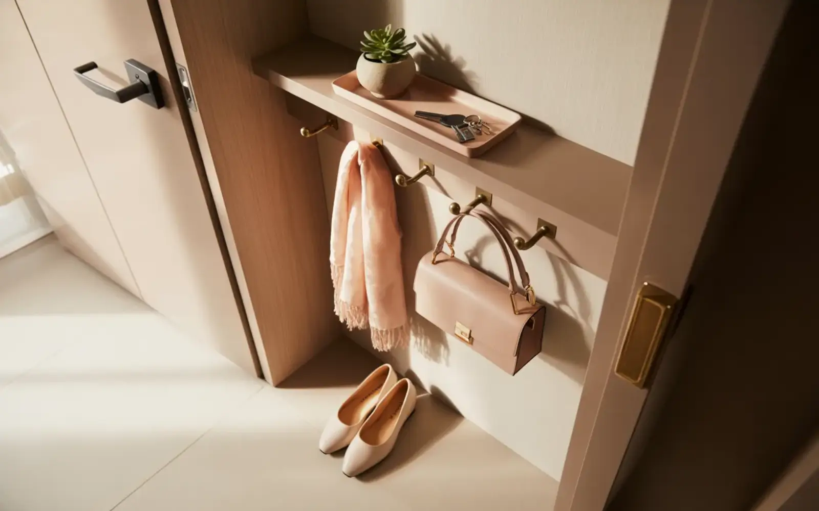
Entry and hallway
The entry of a small apartment is often treated as an afterthought, a metre or two that exists between the door and the rest of the home. In practice it is the zone that sets the tone for everything beyond it. An entry overrun with shoes, coats piled on top of each other, bags on the floor and mail on a surface makes the entire apartment feel one step behind before you have even put your keys down.
The entry requires very little to function well, one clear landing surface for keys, a place for bags to live that is not the floor, enough shoe storage to keep the most used pairs contained and coat hooks or a rail limited to what is in season. A shallow closed unit under a row of hooks, perhaps combined with a small bench where shoes can be removed and stored, handles all of these needs in less than around 60 centimetres of depth. The floor should be kept as clear as possible because in a narrow entry, clear floor space reads as calm and generosity.
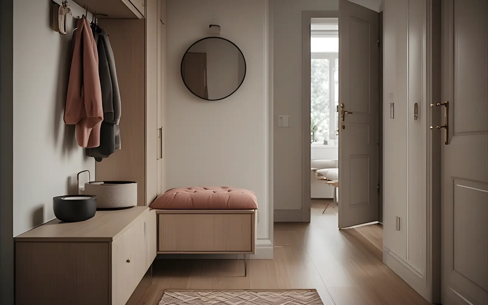
SHALLOW ENTRY STORAGE
Entry with a slim closed unit, bench cushion and a few hooks that handles everyday bags and shoes without turning the hallway into a storage overflow.
The discipline of the entry is that it must be maintained as a transition zone, not a storage overflow. Seasonal items like heavy winter coats, ski bags or beach equipment belong somewhere else in the apartment. The entry holds only what is needed to leave and return comfortably in the current season.
Living room and main room storage
In a small apartment or studio, the main living area often carries the heaviest storage burden. It is where books live, where media equipment sits, where spare throws and cushions accumulate and in many cases where everything that does not fit elsewhere ends up by default. Managing this zone well requires a clear decision about which categories genuinely belong in a living area and which have drifted here from their real home.
The categories that logically live in a main living room are limited, books, media and tech, everyday throws and cushions, perhaps one small basket for remote controls and chargers and a contained space for any hobby that happens in this zone. Work materials, cleaning products, beauty items and overflow clothes do not belong here and when they are present they create the sense that the room is being asked to do too much.
For the storage pieces themselves the most effective approach is low, closed units along one wall, a sideboard, a low media unit or a low bookcase with doors, combined with one or two open shelves directly above for a limited, curated display. Ottomans with internal storage are useful here for throws and guest bedding because they perform their storage function invisibly while contributing to seating or layout. The overall goal for this zone is that storage should be the backdrop of the room, not its focal point.
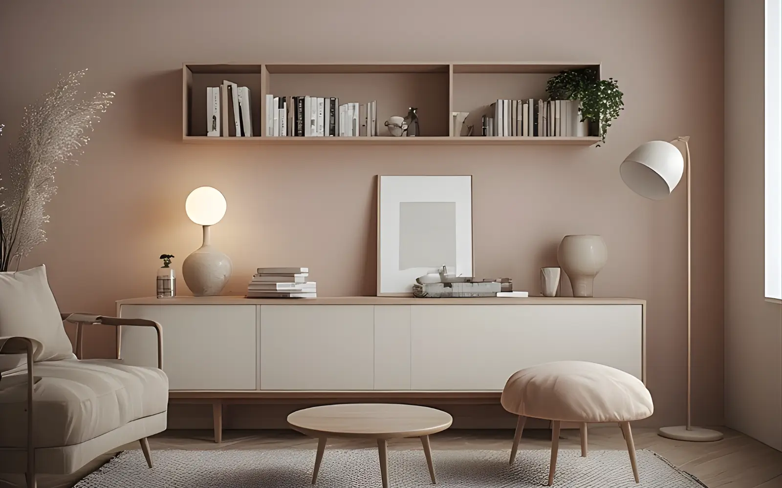
LOW LIVING ROOM STORAGE
Living room where a low sideboard, one open shelf and a storage ottoman keep books and throws contained so the room stays calm and open.
Bedroom and bed zone storage
The sleep zone has its own detailed treatment in the third pillar of this series, so the focus here is on the storage logic that connects to the whole apartment rather than repeating that ground. The most important principle is that the bedroom or bed zone must not become the overflow storage area for everything that cannot find a home elsewhere. When it does, the sleep zone loses its restorative quality.
Wardrobe placement and sizing should be decided early because the wardrobe is almost certainly the largest single storage piece in the apartment and its position affects the room's circulation and light. A wardrobe that is the right size for the clothing and linen it needs to hold, not larger, gives the room back significant space. Bedside storage should be calm and minimal, one small surface for a lamp, a glass of water and a book is usually sufficient.
Work zone and desk in a small apartment
Working from home in a small apartment creates one of the most persistent storage problems. Work materials are visually active, they multiply quickly and they have a natural tendency to colonise every nearby surface. Within a short time the desk area bleeds into the sofa table, the dining table and the kitchen counter.
The solution is to treat the work zone as a contained, self sufficient area with enough storage to hold everything work related within its own footprint. A slim desk with at least one closed drawer for daily essentials, a small shelf above for reference items and a dedicated tray or box where at the end of the working day everything is consolidated is often sufficient. The closing ritual matters, when work is done the desk should be able to recede visually so that the rest of the apartment is not sharing its evening with the evidence of the working day.
Step 5: Open Display Without Visual Chaos
How much display is enough
There is a version of display that makes a small apartment feel personal, warm and considered, and there is a version that makes it feel crowded and impossible to visually rest in. The difference is almost always one of quantity and consistency rather than taste. The problem is not what you own or what you find beautiful, it is how much of it is on show at the same time.
A useful way to think about this is in terms of display capacity, the number of surfaces and shelves in the apartment that can hold a curated arrangement without tipping into clutter. In a small apartment this is typically two or three locations, one shelf, a sideboard or console top, and perhaps the coffee table. When display is limited to these few locations, each one can be thoughtful. When it spreads to every available surface the overall effect is busyness regardless of how carefully each arrangement was made.
Within those limited display areas the principle of fewer larger items over many small ones applies reliably. Three substantial ceramics on a shelf read as a considered arrangement. Fifteen small objects on the same shelf read as a collection waiting to be organised. Repeating materials, a mix of natural wood, matte ceramics and clear glass, creates visual coherence across the apartment without requiring everything to match. Limiting the colour palette of displayed objects to two or three tones quiets the whole room.
Books, decor and sentimental items
Books are one of the few categories that are both genuinely useful and inherently decorative, which makes them a pleasure to work with in a small apartment and also a category that can quickly tip into visual noise. Grouping books by colour tone or spine height significantly reduces this noise while keeping all the books present and accessible.
Sentimental items deserve particular thought because they are the category most resistant to editing. A useful approach is to give them one dedicated location, a specific shelf, a display tray or a small box that is their home. This is very different from scattering sentimental objects across every room as a kind of ambient presence. Concentrated in one place they can be genuinely appreciated, distributed everywhere they become invisible through familiarity while still contributing to the visual weight of the room.
Step 6: Editing Without Becoming Minimalist
The word decluttering has accumulated a kind of moral weight in home design conversations that makes it easy to resist. It implies loss, sacrifice and a lifestyle that does not fit most real people who have jobs, hobbies, books they intend to reread and clothes they genuinely wear. Editing in this guide is about something more practical and less ideological, the idea of capacity lines.
Every storage zone has a capacity, a point at which it holds things comfortably and a point beyond which it starts to work against the room. Recognising when a storage area has exceeded its comfortable capacity is a more useful skill than knowing how to own less in the abstract. The signals are concrete, a wardrobe that requires effort to close, a bookshelf where books are stacked in front of other books, a drawer that catches on something when opened and a cupboard that requires everything to be removed to find what is at the back.
The goal of editing understood this way is not to own very little. It is to ensure that no storage zone is permanently operating beyond its comfortable limit. When a zone exceeds its capacity, the options are to reduce what it holds, move some items to a more appropriate zone or increase the storage available to that zone in a way that does not compromise the room. The important shift is from thinking about editing as a value judgment about ownership to thinking about it as maintenance for the spatial logic of the home.
Step 7: Common Storage and Furniture Mistakes
Understanding what typically goes wrong is often more instructive than a list of what to do. These are the patterns that appear most consistently in small apartments that feel heavy or chaotic despite genuine effort.
- Tall storage on every wall creates the sensation of a room that is closing in. Concentrate tall pieces on one wall and keep the others low.
- Deep wardrobes or units placed directly beside a sofa or bed eat the circulation space that makes a room feel liveable. Use shallower units in circulation zones and deeper ones only where the category genuinely requires it.
- Several small storage pieces scattered across the apartment instead of a consolidated solution make every wall feel busy. A few thoughtfully placed, properly sized units almost always outperform many smaller ones.
- Overusing open shelving for visually noisy categories removes the closed storage that keeps a room calm. Open shelves should hold only what is genuinely curated and maintained.
- Corner furniture that looks efficient on a floor plan but kills real circulation is a classic small apartment mistake.
- Treating every empty wall as an opportunity to add another unit accelerates the process of the room feeling enclosed. Some walls should remain mostly or entirely empty to give the room breathing space.
- Storing items across multiple zones without a clear logic means nothing has a reliable home. When items do not have assigned homes the apartment always feels one step away from chaos.
- Buying furniture to solve aesthetic problems before solving spatial ones adds volume to the room without resolving the underlying issue.
Bringing Storage and Furniture Together
Every well functioning small apartment follows the same underlying sequence. It begins with a clear eyed inventory of what needs to live in the space, followed by an honest allocation of each category to the zone where it is actually used. From there, storage is chosen based on what the room's volume and light can support, concentrated rather than scattered, predominantly closed with limited open display and scaled to respect sightlines and circulation.
Furniture is chosen last in terms of specifics but first in terms of strategic logic. Each major piece must earn its footprint in at least two ways, contribute to the visual calm of the room and support the layout rather than work against it. The feeling of not enough room in a small apartment is almost never a square metre problem, it is a framework problem.
You do not need more space, you need a framework, a set of clear decisions about what lives where, how much is enough and what the room is allowed to look like. Made once and maintained reasonably, those decisions do most of the work quietly in the background, leaving the apartment free to be what it was always capable of being, a small home that feels complete, considered and entirely your own.
Explore more small-space ideas
If you want to keep planning your apartment, these guides go deeper into layouts, walls and workspaces:
- Aesthetic Room & Bedroom Ideas for Small Apartments – layouts, lighting, colour and storage recipes for cozy, feminine bedrooms.
- Walls, Color & Art – renter-friendly wall ideas that connect with your bedroom palette.
- Feminine Home Office Design – how to fit a desk into a small, aesthetic apartment.
- Aesthetic Styles & Vibes – choose the overall mood for your whole home.
Dive deeper into each small-apartment step
Choose the stage you are working on and jump straight to the part of this guide that matches it.
Step 1
Zoning & layouts
How to map your floor plan, define zones and choose layouts that work in real small apartments.
Step 2
Small living rooms
Sofa scale, media walls and multi-use layouts for living rooms that still feel like rooms.
Step 3
Studio bedrooms
Ways to carve out a calm, feminine sleep zone inside one open studio room.
Step 4
Storage & furniture
Storage walls, multi-use pieces and display rules that keep a small home calm.